How to use mind maps when designing a new website
If you’ve decided to build a new website for either pleasure or business, you’re no doubt wondering how to get all of those ideas for the design, navigation and content out of your head and onto the world wide web.
You may even have started to plan the website already. If so, I bet you’ve got several Word documents and spreadsheets full of notes, ideas and lists of everything you need to do.
It’s a mess, isn’t it?
Fear not, for there is a far better answer when it comes to planning the design of a new website, and it comes in the form of mind mapping.
What are mind maps?
Mind mapping is a brilliant way to boost creativity. By devising a mind map, you can untangle your thoughts and present your ideas in a way that is engaging and easily decipherable by others.
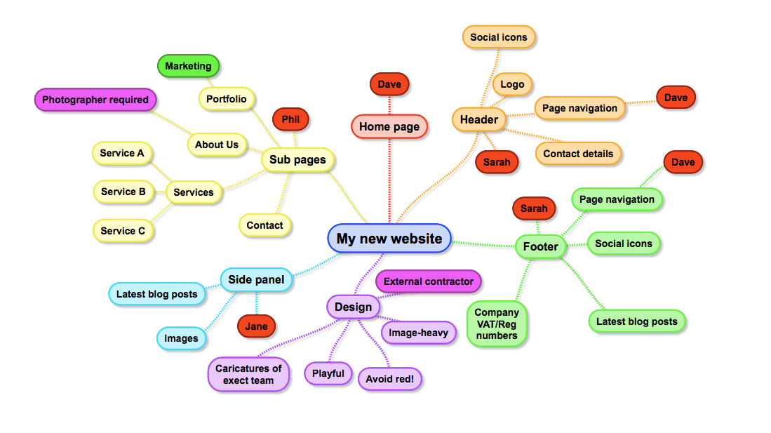
I’ve provided an example mind map further down in the post, and you’ll note that it is made up of circled words, names and phrases, all joined by dotted lines and colour-coded. They are brilliantly simple and elegantly functional.
Benefits of mind maps
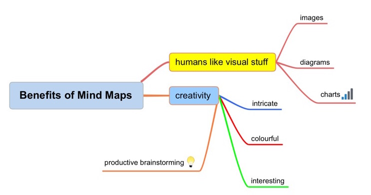
Humans like visual stuff; we enjoy looking at things that excite our brains and mind maps do just that. They’re colourful, intricate and interesting, and as a result, draw us in. They’re also incredibly easy to contribute to. Several people can add their own thoughts easily to a single mind map and they encourage productive brainstorming.
Step-by-step guide to creating a website mind map
So, I’ve hopefully convinced you that mind mapping is the key to helping you realise your idea for a new website.
Here’s how to do just that in 5 simple steps:
1) Start in the centre of the page and note your website’s name or address – it is the central theme and the one thing on which you must concentrate.
2) Surround your website name with the key elements. These may be the homepage, sub pages, along with the header and footer, but remember to include things like ‘design’, which will enable you to brainstorm how the website will look and feel.
3) Against each element, add further stems to flesh them out. For example, your subpage stems may be ‘About Us’, ‘Services’ and ‘Portfolio’, while against design you may note things such as ‘image-heavy’, ‘playful’, or notes about styles you’d like to avoid.
4) Chances are, there’ll be a few people involved in the creation of your website, so make reference to their areas of responsibility by circling their names against the various elements each will be involved in.
5) Get colourful! Colour-code each of the elements on you mind map. They can signify whatever you want, but the task here is to introduce some consistency to the mind map and make it visually appealing.
Once finished, your mind map will look something like my mockup, below:

Summary
Mind maps are brilliant ways to release the best thoughts from our brains, and I hope the above tips help you create your new website. All you need to get started is a piece of paper and some coloured pens, although a quick Google for ‘free mind mapping tools’ will unearth plenty of digital ways to get started, too!
Happy mind mapping!

